Visual Hierarchy That Converts: A Design Principles Playbook
Your website has milliseconds to communicate what matters. Visual hierarchy is the invisible hand that guides users from curiosity to conversion. Here's how to wield it effectively.
Gosai Digital Team
January 2026
You've done this. Landed on a page, scanned for two seconds, and left because nothing grabbed you. That snap judgment happens on your site too.
Visual hierarchy is the science of controlling that scan. It's how you arrange elements so the most important information gets seen first, and actions become obvious. Done right, it feels effortless to users. Done wrong, visitors bounce before they ever understand what you offer.
This playbook distills the principles that separate high-converting websites from digital noise. Whether you're designing your first landing page or optimizing an enterprise site, these fundamentals apply universally.
See the Difference
Drag the slider to compare poor visual hierarchy (left) with optimized hierarchy (right). Notice how clear focal points and intentional contrast guide your eye.
The Numbers Behind Visual Design
of web text is ignored
Eye-tracking research on page scanning behavior
conversion lift from reduced form fields
Reducing fields from 11 to 4 via cognitive load theory
attention on primary CTAs
Average CTA attention from predictive eye tracking
Understanding How Users Scan
Before you can guide attention, you need to understand how users naturally move through a page. Two patterns dominate web scanning behavior.
Pro tip: Combine both patterns
Use Z-pattern for your homepage hero, then transition to F-pattern as users scroll into content sections. This creates a natural visual flow from impact to information.
The 8 Core Principles
These principles form the foundation of effective visual hierarchy. Master them, and you'll intuitively know how to guide attention on any page.
Bigger = more important. Full stop.
Stark differences between elements draw attention to the brighter or bolder one. A blue button on a gray page pops. A bold headline in light body text stands out. Use contrast strategically to highlight what matters most.
Bright colors catch eyes ahead of muted tones. But color also carries meaning: red signals errors or urgency, green indicates success, blue suggests trust. Use your brand's accent color exclusively for interactive elements and CTAs.
The Pattern Shift
Notice how the first four principles manipulate visual weight. The next four control spatial relationships. They work together.
Elements placed close together are perceived as related. A label should be closer to its field than to other labels. Feature descriptions should be near their icons. Related form fields should be grouped visually.
Nothing screams 'amateur' like misaligned elements. Proper alignment creates invisible lines that guide the eye and establish visual order. Use consistent grids and snap elements to them religiously.
Repeating visual elements creates consistency and professionalism. Use the same button style everywhere. Keep heading styles consistent. If icons are outlined on one feature card, they should be outlined on all of them.
Motion draws eyes instinctively. Use subtle animations to guide attention to CTAs or important messages. But use sparingly: too much motion creates chaos. Animation is a spice, not the main course.
Designing CTAs That Convert
Your call-to-action is the culmination of all hierarchy principles. Here's how to ensure users can't miss it.
Place Along Natural Eye Paths
Position CTAs where the F or Z pattern naturally ends. Top-right for navigation CTAs, end of content sections for in-page CTAs. Never hide CTAs in corners or below the fold on conversion pages.
Use High-Contrast Colors
Your primary CTA should use a color that appears nowhere else on the page except in your brand accent. This 'color isolation' ensures maximum visibility. Secondary CTAs should be noticeably muted.
Size Appropriately (Fitts's Law)
The time to click a target is a function of its size and distance. Make primary CTAs large enough to be an easy target. On mobile, ensure tap targets are at least 44x44 pixels with adequate spacing.
Surround with Whitespace
Give your CTA room to breathe. Surrounding whitespace isolates the button visually and increases its perceived importance. Don't cram CTAs against other elements.
CTA Hierarchy Example
Reducing Cognitive Load
Users have limited mental processing capacity. Every element on your page competes for attention. Reduce the noise, and your signal gets through.
Hick's Law: more choices = longer decision time. Limit navigation items to 7 or fewer. Offer 3-4 pricing tiers, not 10. Each additional choice dilutes attention from what matters.
Show only what's needed now. Hide complexity behind 'Learn more' links, expandable sections, or subsequent pages. Let users opt into detail rather than drowning in it.
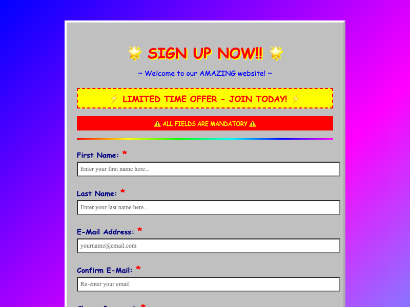
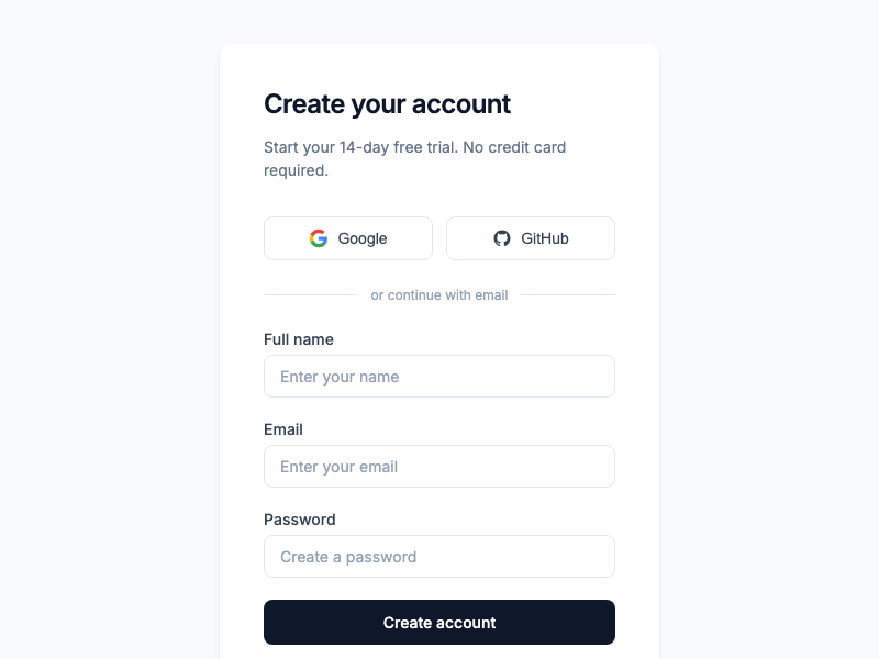
Research shows reducing form fields from 11 to 4 increases conversions by 120%. Ask only what you need. If a field is optional, question whether you need it at all.
Common Hierarchy Mistakes
These errors undermine even well-intentioned designs. Audit your pages for these patterns.
Everything is equal
When all elements are the same size, weight, and color, users don't know where to look first. If everything is important, nothing is important.
CTA buried below the fold
If your primary action requires scrolling to find, most visitors will never see it. At minimum, hint at the CTA's existence above the fold.
Competing CTAs
Two equal buttons = decision paralysis
Primary button + text link = clear hierarchy
Low contrast text
Light gray text on white backgrounds fails accessibility standards and hurts readability for everyone. Body text should maintain at least 4.5:1 contrast ratio.
Animation overload
When everything moves, nothing stands out. Limit animation to one or two key moments per page. The hero can animate; the feature grid probably shouldn't.
Your Hierarchy Checklist
Run through these questions before launching any page.
First Impression (0-3 seconds)
Visual Design
Readability
The Bottom Line
Visual hierarchy isn't decoration. It's communication infrastructure. Every design decision either guides users toward your goal or pushes them away. The principles in this playbook aren't arbitrary rules; they're patterns that align with how human vision and attention actually work.
By 2026, visual hierarchy has moved from 'nice to have' to 'essential.' Websites that clearly guide visitors through content feel more engaging, easier to use, and far more likely to turn a quick visit into a meaningful conversion.
Start with the basics: make important things big, give elements room to breathe, use contrast to highlight CTAs, and reduce choices to reduce confusion. Master these fundamentals, and you'll be ahead of most of the web.
Need help with your visual design?
We build websites and digital experiences that convert. If you're looking to improve your site's hierarchy and performance, let's talk.
Continue reading
Related resources
Keep moving through the same operating model with a few nearby articles from the same topic cluster.
26 UI Principles Every Builder Should Know
Master the fundamental UI/UX principles that separate amateur interfaces from professional ones. From Fitts's Law to Gestalt principles, learn the science behind great design.
Foundational
February 1, 2026
Building Internal Tools Your Team Will Actually Use
Most internal tools fail because they're built for executives, not end users. Learn how to design tools that employees love through user research, friction reduction, and AI-powered assistance.
Applied
January 1, 2026
Salesforce Reporting for Staffing Firms: Pipeline, Margin, and Recruiter Productivity
Salesforce reports in staffing firms are often wrong because the source objects, field conventions, and report types were built for a generic sales org. Here's how to fix the three layers that determine whether your numbers are trustworthy.
Applied
March 1, 2026
Resource updates
Get notified when new guides go live.
Practical notes on Salesforce, staffing workflows, and operational cleanup. No newsletter bloat.